SCOPE OF WORK:
Brand Identity, Color, Typography, Illustration, Art Direction, Asset Suite, Packaging, Brand Guidelines, Website, Email, Go-To-Market Campaign, Social Templates
Brand Identity, Color, Typography, Illustration, Art Direction, Asset Suite, Packaging, Brand Guidelines, Website, Email, Go-To-Market Campaign, Social Templates
RECOGNITION:
︎︎︎ Clio Bronze︎︎︎ Over 1M organic impressions
PRESS:
︎︎︎ AdAge
︎︎︎ Adweek
︎︎︎ Creative Review
︎︎︎ Clio Bronze︎︎︎ Over 1M organic impressions
PRESS:
︎︎︎ AdAge
︎︎︎ Adweek
︎︎︎ Creative Review
Inputting data. Outputting dank 🍃
As the market leader, Eaze understood that their objective was no longer to de-stigmatize weed for first-time smokers, but rather, to celebrate weed for those who have already become regular consumers. And now, Eaze is confidently positioning themselves as the lovable weed nerds—experts in data, delivery, and, of course, dank.
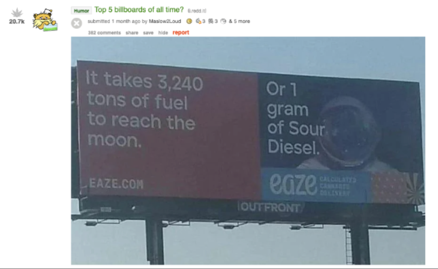
The project involved a massive rebrand along with a 360 campaign to launch it all. The campaign generated millions of views, with people snapping pics of our billboards and posting to Twitter, Instagram, and Reddit’s r/trees. It gained traction online when one Reddit user included it in a viral post: “Top 5 Billboards of All Time?”.


In glitch-art fashion, our content takes on randomized styles—from 8-bit to 3D rendering—and subject matters—from bubble baths to moon landings.


We created a grid system to enforce laws around our lawless content. The grid provides clarity and better brand recognition for our “random” content and copy. All of this is grounded by an understated refresh to their logo.


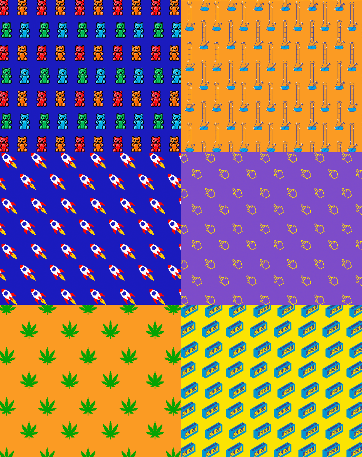
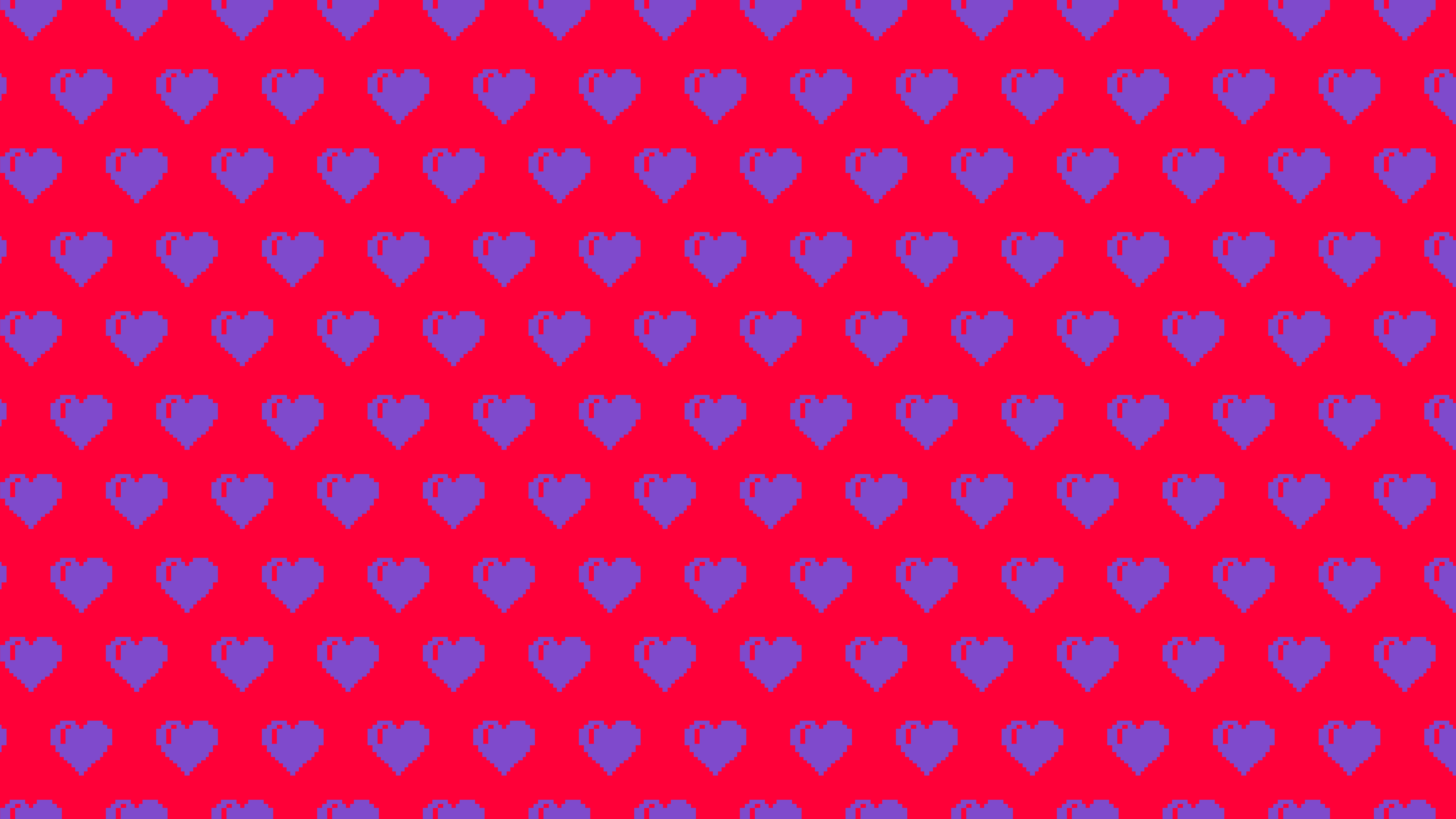
Hundreds of different hand-drawn illustrations, trippy patterns, 8-bit graphics, custom renderings, and public domain images were developed for this brand campaign. Leaning into the anti-design approach, further speaking to the defiant weed nerds.


